The art of designing an aircraft livery


When he was a kid in rural Canada, Edmond Huot loved to build small model planes and come up with stories while playing with them. Fast forward thirty years and he is still using planes for storytelling. This time it is for real though.
With aircraft acting as giant billboards on which each airline strives to convey what it stands for, livery designers like Huot face the challenge of capturing the essence of the brand and transposing it to the curved metal surface of an airliner.
From the staid lines and national flags that adorn some of the most traditional legacy carriers to the cornucopia of bright, flashy colors that many low cost carriers use to catch the attention of the public, each airline livery is a public statement, a story-telling device.
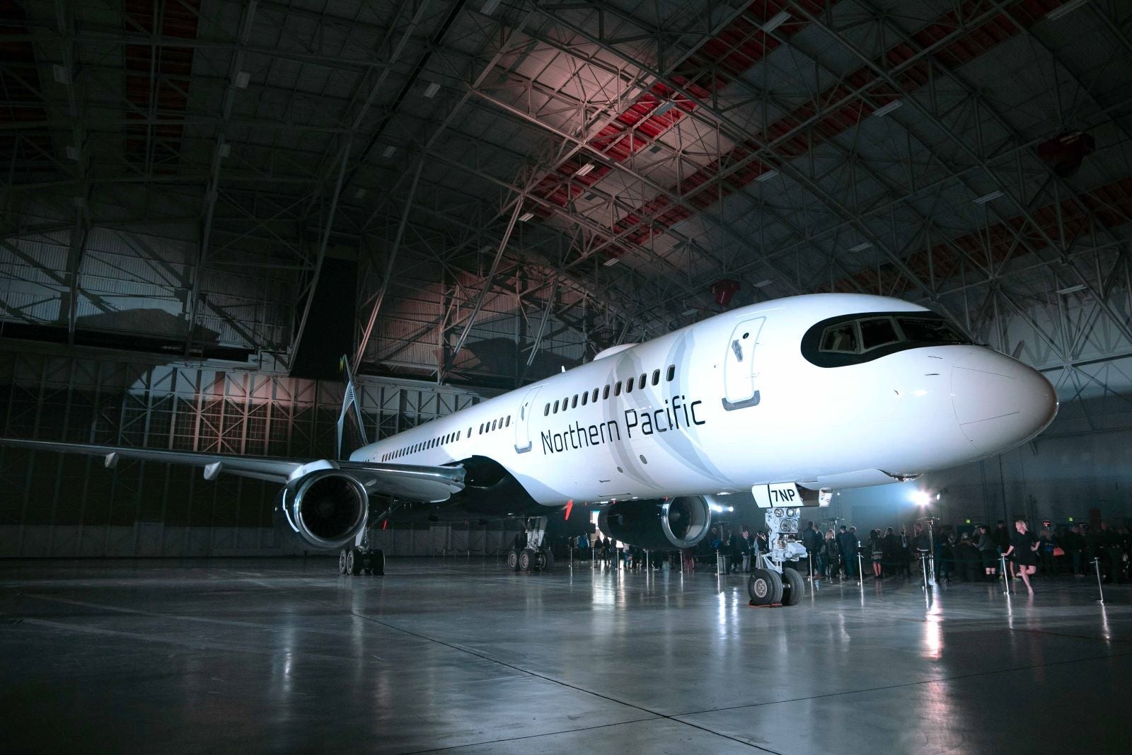
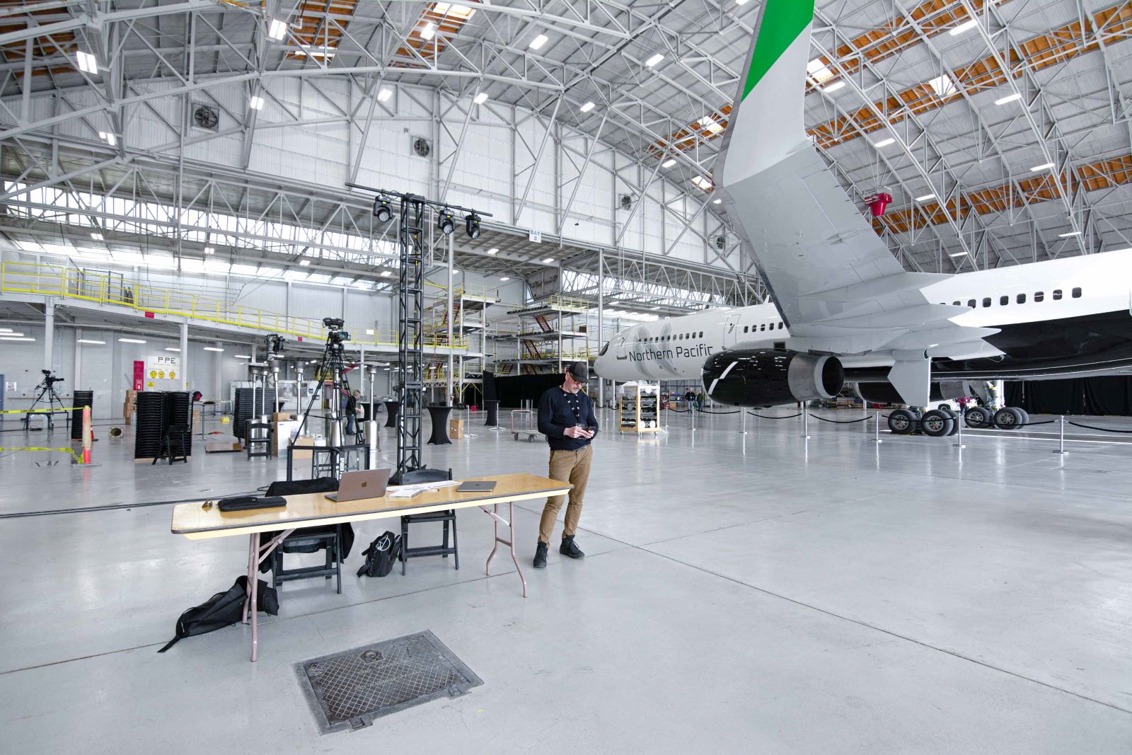
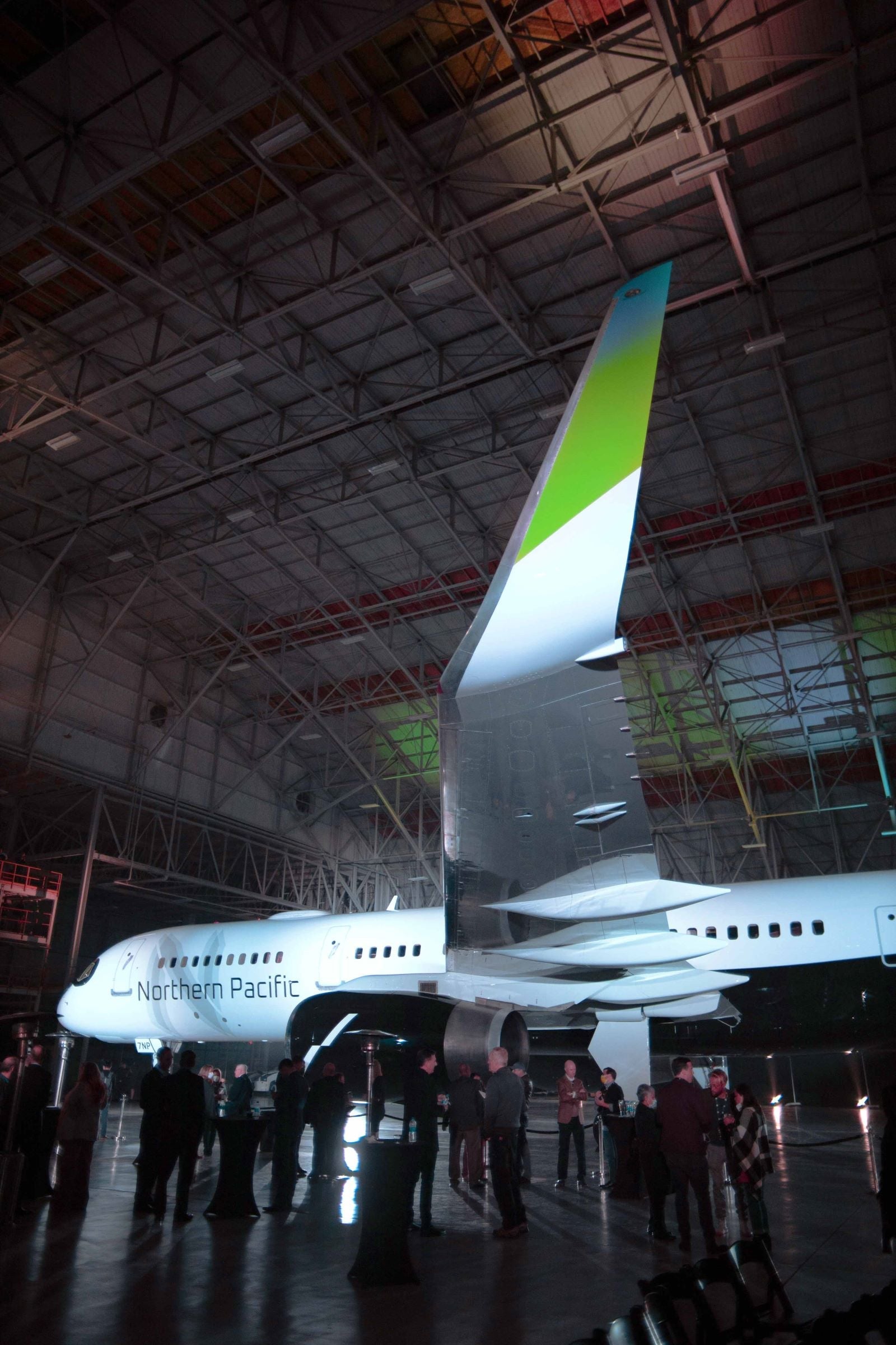
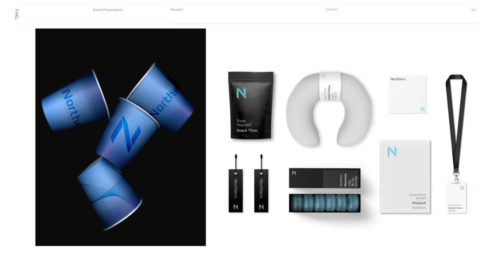
"Designing an airline livery has many, many things in common with the creation of a tourism promotion campaign. You try to encapsulate the essence of a place and the magic of travel in a way that people can immediately recognize," said Huot when explaining his latest project, the livery of Northern Pacific Airways, a new airline based in Alaska that aims to connect the U.S. and Asia by way of Anchorage.
In this case, inspiration came from the nature of America's northernmost state: the dominant black and white tones with sprinkles of green and some shades of grey, evoke the ice and rock of Alaskan arctic landscapes as well as the northern lights.
A way to differentiate a livery is to use elements that are specific to the airline's place of origin. This is a recourse that quite a few carriers have used with spectacular results.
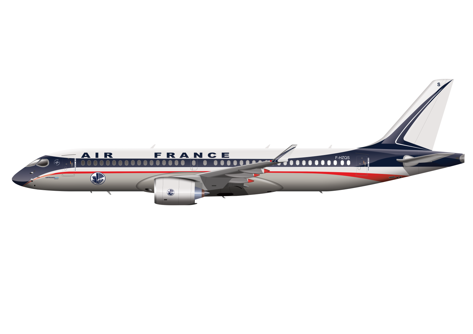
Take, for example, Brussels Airlines "Best of Belgium" series. The Belgian airline has transformed several of its Airbuses into flying works of art featuring masters such as Magritte and Bruegel or the fantasy worlds of Tintin and The Smurfs, or the "retro" liveries that bring long-gone color schemes back to life. The latter have become a popular tool for some of the more storied airlines to link back to a past of perceived elegance and exclusivity.
"There is so much to say about iconic retro liveries, they were perfectly adapted to aircraft shapes and they had a strong identity. That's why I like to put retro liveries on modern aircraft," says Guilhem, an aviation professional and airline design enthusiast that comes up with fantasy liveries for existing airlines and publishes them on "La Livery" website and social media channels.
Guilhem, who is currently working on a book that compiles and analyzes some 500 different airline liveries, complains that many present-day liveries are too bland. In addition to coming up with new bold color schemes for current airline fleets, he has done the reverse exercise: applying present-day liveries to historical aircraft models, such as the DC-3 or the SuperConnie to see how they would have looked.

"When I put current liveries on old aircraft types, there is no magic," he says, before adding that around 40% of the liveries he has studied follow the Eurowhite style, which basically leaves most of the fuselage white and applies a simple color scheme to the tail.
This pattern, which according to Guilhem accounts for as much as 90% of new airline liveries, is due in no small measure to financial factors. "It's clean, but soulless. I can understand why they choose it though, it has lower costs, both of painting and maintenance, and it's easy to create … or perhaps airlines no longer see the liveries too much as an advertising opportunity, which to me sounds like nonsense at the time of Instagram!"
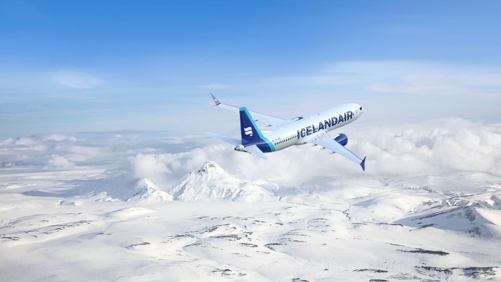
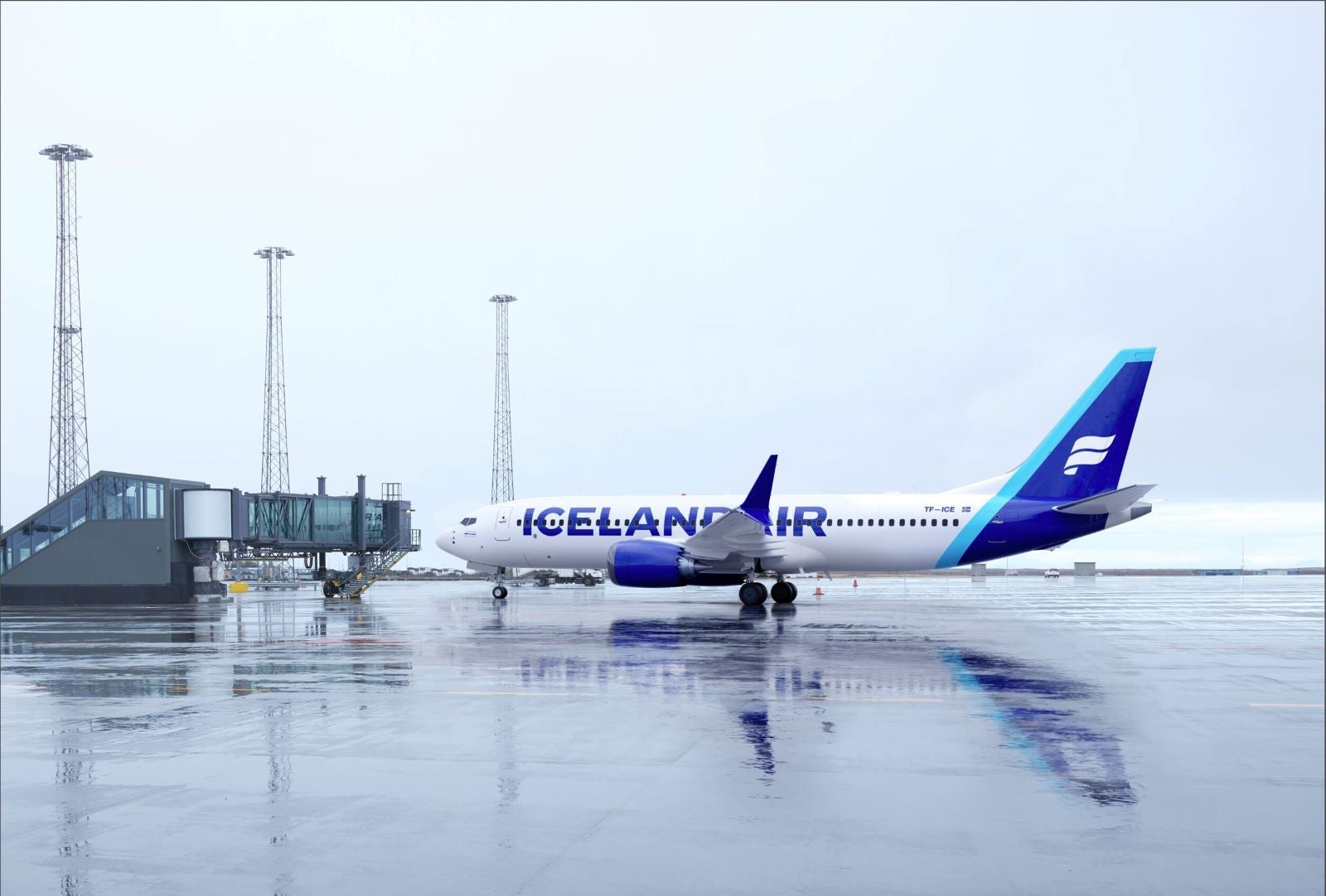
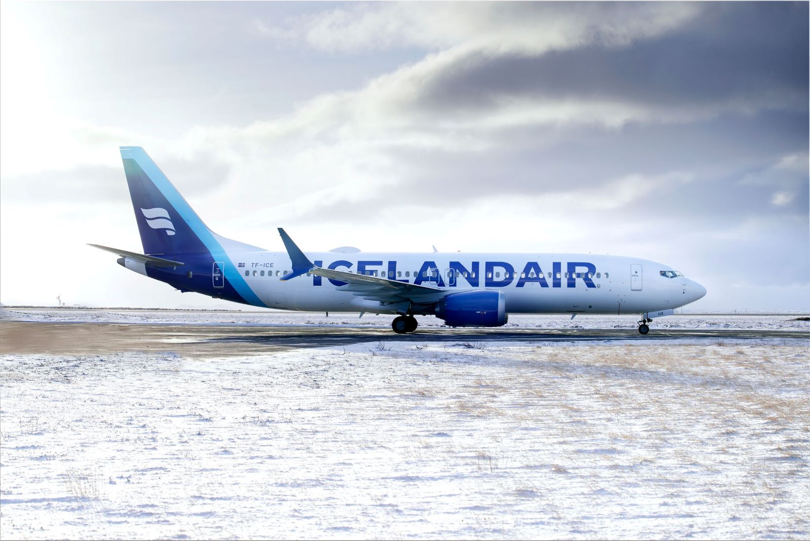
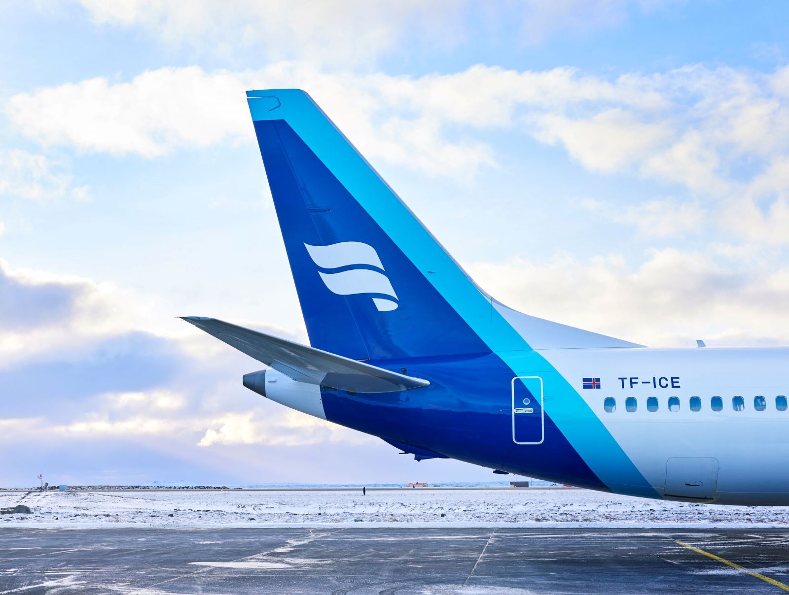
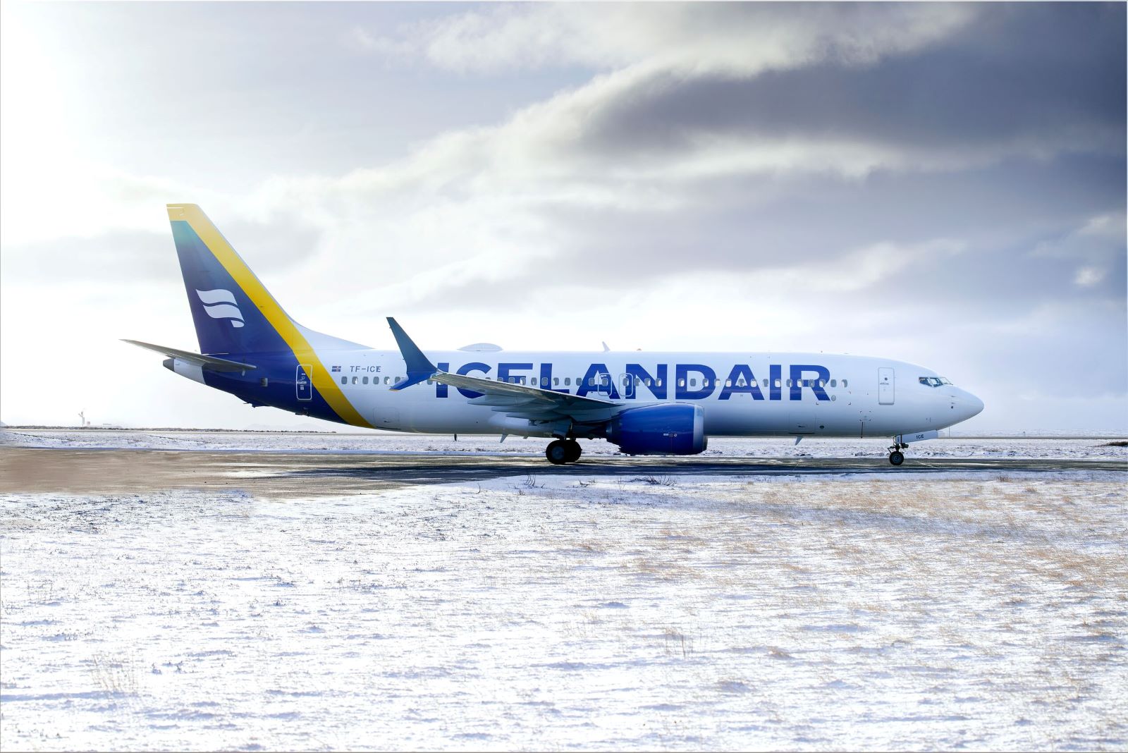
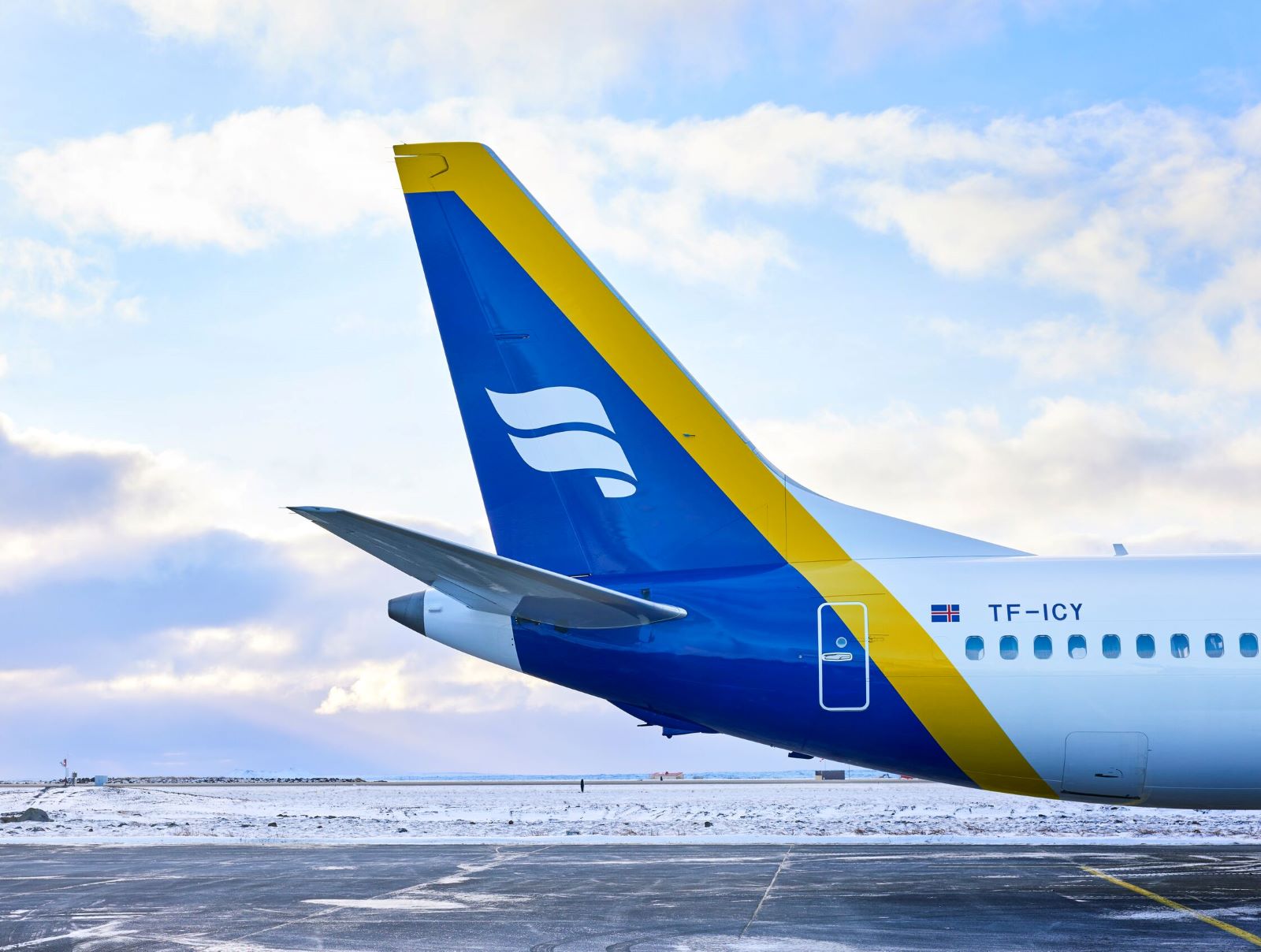
Social media was very present in Icelandair's decision to renew their livery. Rather than one color scheme, the airline has opted for a palette of five different colors to adorn the tail of its aircraft. Icelandair expects this panoply of brighter and more vibrant colors to appeal to the social media generation.
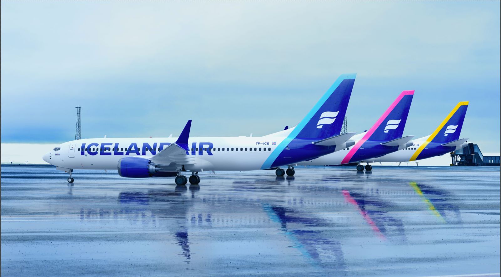
"Our latest rebranding was in 2006, when social media networks were in their infancy and platforms such as Instagram did not even exist," explains Gísli S. Brynjólfsson, marketing director at Icelandair.
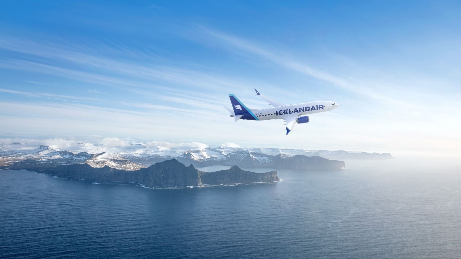
As in the case of Northern Pacific Airways, Icelandic nature and the northern lights have been a source of inspiration for Icelandair. In fact, these motives were already celebrated in a couple of Icelandair special liveries, the "Hekla Aurora" and "Vatnajökull" paint schemes (both will remain in place despite the fleet repainting).
"It is not just about nature per se, it is about the way nature has molded the Icelandic people, how, despite the cold weather, we are a warm, welcoming culture," elaborates Brynjólfsson.
He also dismisses some early criticism that the lettering on the side of the aircraft, which is 70% larger than in the previous version, was reminiscent of Ryanair. "We did some surveys and found out that most people were familiar with the logo, but many were unable to link it to the brand. It is important that people are able to read it well and remember it. This is why many airlines are using larger fonts. We are not trying to reinvent the wheel!"
With two aircraft already sporting the new livery, and a third one soon on the way, Icelandair is actively monitoring the public response on social media and the results so far are encouraging, with around 95% of reactions positive or neutral, according to Brynjólfsson.
So which steps are involved in the creation of a new livery?


"Right after receiving an assignment, I conduct thorough research about the airline, its story and its fleet. It is not just about the livery, but about the whole brand image of the airline," explains Huot. "When they asked me to design Northern Pacific's livery, I printed the Boeing 757-200 outline on an empty background, many copies of it, and then by hand tried all sorts of combinations of colors and shapes. Together with my team, we would stick them to boards and then to the walls of our office. This is the most creative stage of the process. The atmosphere is like that of an artist's studio."
Out of this brainstorming exercise, a handful of options were selected. What looks great on paper may not work as well when transposed to the surface of a 155 ft-long airframe, so the next step is 3D rendering providing a virtual 360 (degree ) realistic view of the aircraft.
The choices narrow down again and again before it's time to go see the client.
"I would usually present just one option to the airline … but I like to keep two or three more options in my pocket, just in case. You can see how things are going when you see them nodding silently as you guide them through the concept, the story."
As soon as the livery has been approved, the paint job is handed over to specialized firms, which take care of the technicalities: the type of paint, the type of process to be used and so on.
The designer's job is far from over though, said Huot, who explains how he had to fly over to the painting facility in South Carolina to supervise the mixing of colors for Northern Pacific's first aircraft to make sure they reflected with precision the identity he had come up with.
"For me a livery is great when people can identify an airline through it and this implies that this livery must be original and stand out from others," concludes Guilhem, the creator of La Livery.
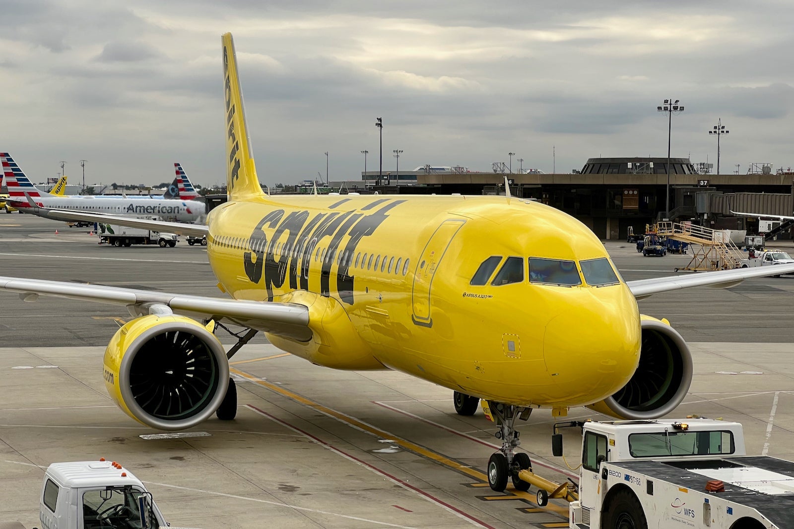
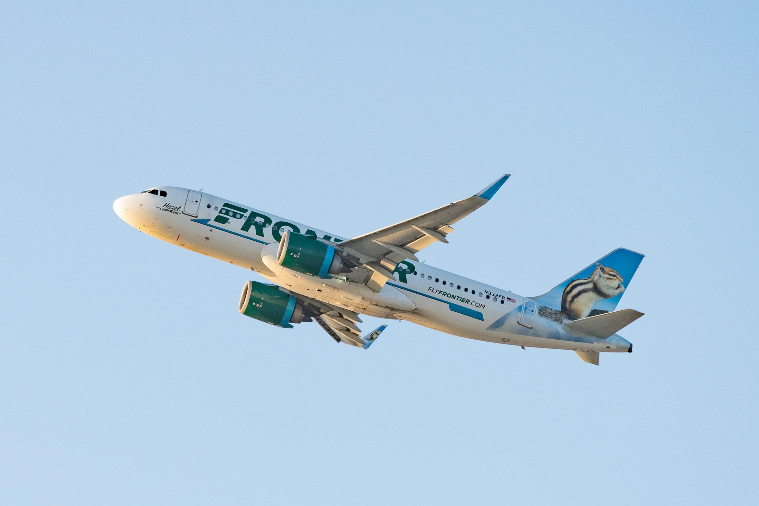
This condition is certainly met by two American carriers that have just announced their merger. With Spirit Airlines pretty much "owning" yellow and Frontier being well known for its aircraft tails featuring realistic depictions of American fauna, one of the main questions that comes to mind is: "Which of these two liveries will ultimately prevail?"
TPG featured card

at American Express's secure site
Terms & restrictions apply. See rates & fees.
| 4X | Earn 4X Membership Rewards® points per dollar spent on purchases at restaurants worldwide, on up to $50,000 in purchases per calendar year, then 1X points for the rest of the year. |
| 4X | Earn 4X Membership Rewards® points per dollar spent at US supermarkets, on up to $25,000 in purchases per calendar year, then 1X points for the rest of the year. |
| 5X | New! Earn 5X Membership Rewards® points on prepaid hotel stays booked through AmexTravel.com or the Amex Travel App. |
| 3X | Earn 3X Membership Rewards® points on flights booked through AmexTravel.com, the Amex Travel App, or purchased directly from airlines. |
| 2X | Earn 2X Membership Rewards® points on prepaid car rentals booked through AmexTravel.com or the Amex Travel App and cruises booked and paid through AmexTravel.com. |
| 1X | Earn 1X Membership Rewards® point per dollar spent on all other eligible purchases. |
Pros
- Valuable dining and food-related credits
- Flexible rewards with airline and hotel transfer partners
- Multiple travel and purchase protections
- No foreign transaction fees
- Access to Amex Offers for additional savings (enrollment required)
Cons
- Not as useful for those living outside the U.S.
- Some may have trouble using Uber and other dining credits
- You may be eligible for as high as 100,000 Membership Rewards® Points after you spend $8,000 in eligible purchases on your new Card in your first 6 months of Card Membership. Welcome offers vary and you may not be eligible for an offer. Apply to know if you’re approved and find out your exact welcome offer amount – all with no credit score impact. If you’re approved and choose to accept the Card, your score may be impacted.
- Earn 4X Membership Rewards® points per dollar spent on purchases at restaurants worldwide, on up to $50,000 in purchases per calendar year, then 1X points for the rest of the year.
- Earn 4X Membership Rewards® points per dollar spent at US supermarkets, on up to $25,000 in purchases per calendar year, then 1X points for the rest of the year.
- New! Earn 5X Membership Rewards® points on prepaid hotel stays booked through AmexTravel.com or the Amex Travel App.
- Earn 3X Membership Rewards® points on flights booked through AmexTravel.com, the Amex Travel App, or purchased directly from airlines.
- Earn 2X Membership Rewards® points on prepaid car rentals booked through AmexTravel.com or the Amex Travel App and cruises booked and paid through AmexTravel.com.
- Earn 1X Membership Rewards® point per dollar spent on all other eligible purchases.
- Pay It® lets you tap in the American Express® App to quickly pay for small purchase amounts throughout the month and still earn rewards the way you usually do. Plan It® gives you the option to split up big purchases into equal monthly payments with a fixed fee. You’ll know upfront exactly how much you’ll pay.
- Updated! $120 Dining Credit: Earn up to a total of $10 in statement credits monthly when you pay with the Gold Card at Grubhub (including Seamless), Buffalo Wild Wings, Five Guys, The Cheesecake Factory, and Wonder. This can be an annual savings of up to $120. Enrollment required.
- $100 Resy Credit: Get up to $100 in statement credits each calendar year at over 10,000 qualifying U.S. Resy restaurants after you pay for eligible purchases with the American Express® Gold Card. That’s up to $50 in statement credits semi-annually. Enrollment required.
- $84 Dunkin' Credit: Earn up to $7 in monthly statement credits after you pay with the American Express® Gold Card at U.S. Dunkin’ locations. Enrollment required.
- $120 Uber Cash on Gold: Enjoy up to $120 in Uber Cash annually with your Gold Card. Just add your Card to your Uber account and you'll get $10 in Uber Cash each month to use on orders and rides in the U.S. when you select an Amex Card for your transaction.
- New! As an American Express® Gold Card Member, you can enjoy complimentary Hertz Five Star® Status. Enjoy benefits like skipping the counter at select locations, adding an additional driver at no additional cost*, and vehicle upgrades**. Benefit enrollment and Hertz Gold+ registration are required. *Additional drivers must meet standard rental qualifications and must be a spouse or domestic partner to qualify as complimentary. Other additional drivers subject to fees. **Benefits are subject to availability and vary by location. Additional Hertz program Terms and Conditions including age restrictions apply.
- Take advantage of a $100 credit towards eligible charges* at over 1,300 upscale hotels worldwide when you book The Hotel Collection through AmexTravel.com or the Amex Travel App **. *Eligible charges vary by property. **The Hotel Collection requires a two-night minimum stay.
- Book your travel through the Amex Travel App with added peace of mind – backed by American Express® service and support. Only for American Express® Card Members.
- Whenever you need us, we're here. Our Member Services team will ensure you are taken care of. From lost Card replacement to statement questions, we are available to help 24/7.
- No Foreign Transaction Fees.
- Annual Fee is $325.
- Terms Apply.