American Express Launches New Account Dashboard


American Express has released an updated user interface on its website. The new dashboard looks slick and refreshing — though it may take some time for Amex cardholders to get used to.
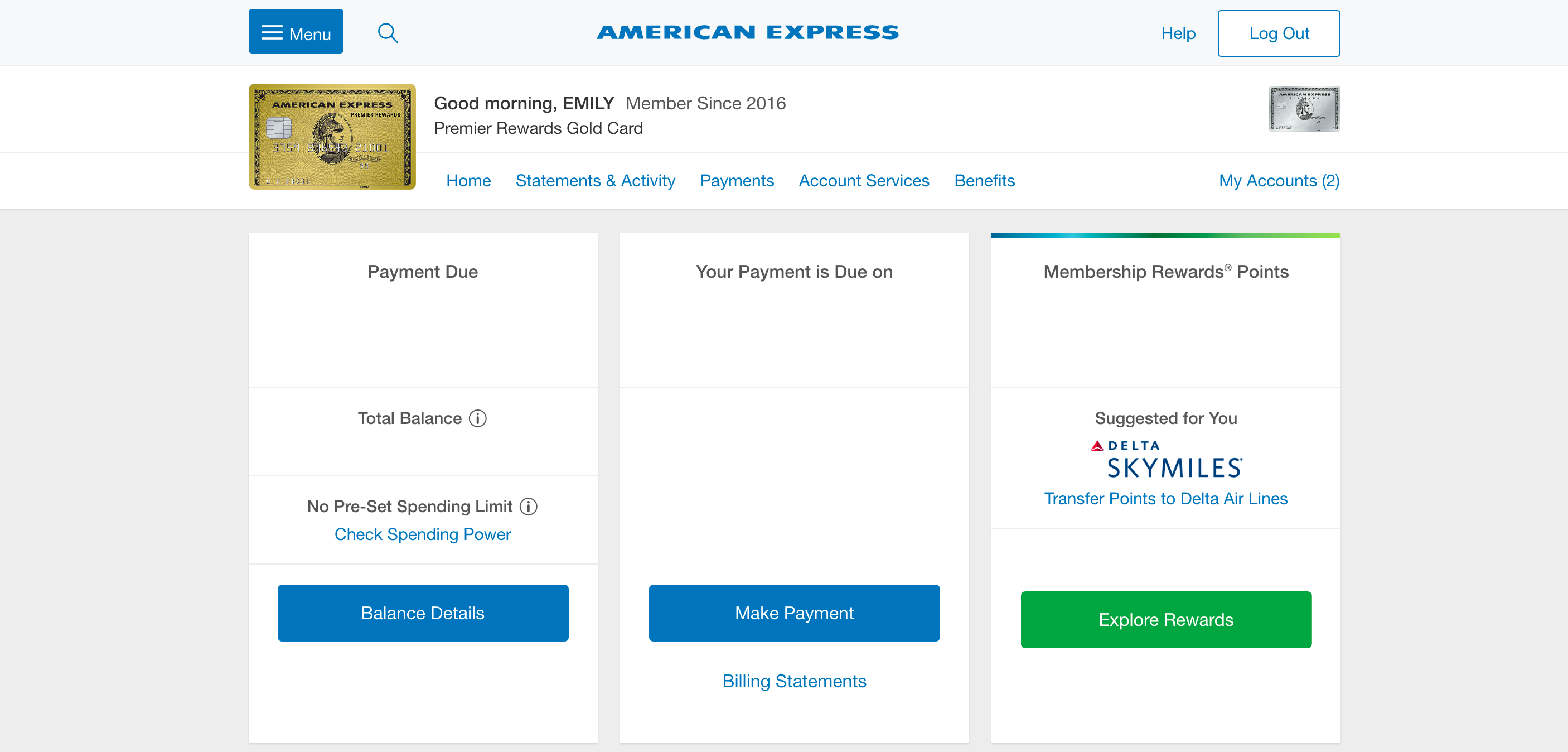
Here's what the new Amex dashboard looks like:
It has many of the same general functions as the old version of the website, which can be found below:
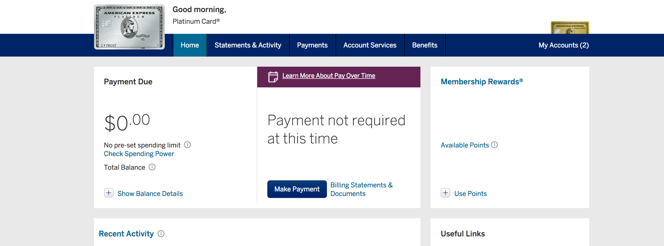
The new site seems to have the same general layout as the old version. Your Membership Rewards balance appears in the same spot on the right side of the page, and your balance and payment due date appear in the same position on the left and center of the page, respectively. It looks like Amex changed the color scheme and the general feel of the site — it feels a bit less boxy and a little more airy.
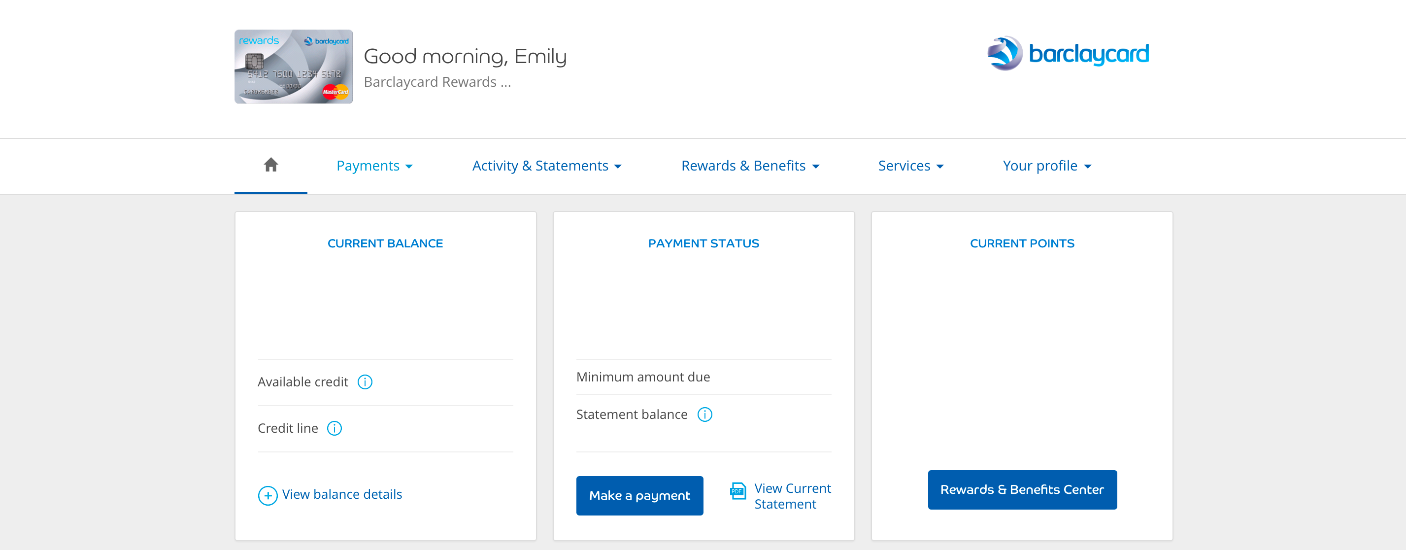
In fact, the new layout looks a lot like that of Barclaycard:
Overall, the new interface is a clean and updated look for Amex. While the changes aren't huge, they're likely to make navigating the site easier — and easier to look at.

What do you think of the new Amex cardholder dashboard?
TPG featured card

at American Express's secure site
Terms & restrictions apply. See rates & fees.
| 4X | Earn 4X Membership Rewards® points per dollar spent on purchases at restaurants worldwide, on up to $50,000 in purchases per calendar year, then 1X points for the rest of the year. |
| 4X | Earn 4X Membership Rewards® points per dollar spent at US supermarkets, on up to $25,000 in purchases per calendar year, then 1X points for the rest of the year. |
| 5X | New! Earn 5X Membership Rewards® points on prepaid hotel stays booked through AmexTravel.com or the Amex Travel App. |
| 3X | Earn 3X Membership Rewards® points on flights booked through AmexTravel.com, the Amex Travel App, or purchased directly from airlines. |
| 2X | Earn 2X Membership Rewards® points on prepaid car rentals booked through AmexTravel.com or the Amex Travel App and cruises booked and paid through AmexTravel.com. |
| 1X | Earn 1X Membership Rewards® point per dollar spent on all other eligible purchases. |
Pros
- Valuable dining and food-related credits
- Flexible rewards with airline and hotel transfer partners
- Multiple travel and purchase protections
- No foreign transaction fees
- Access to Amex Offers for additional savings (enrollment required)
Cons
- Not as useful for those living outside the U.S.
- Some may have trouble using Uber and other dining credits
- You may be eligible for as high as 100,000 Membership Rewards® Points after you spend $8,000 in eligible purchases on your new Card in your first 6 months of Card Membership. Welcome offers vary and you may not be eligible for an offer. Apply to know if you’re approved and find out your exact welcome offer amount – all with no credit score impact. If you’re approved and choose to accept the Card, your score may be impacted.
- Earn 4X Membership Rewards® points per dollar spent on purchases at restaurants worldwide, on up to $50,000 in purchases per calendar year, then 1X points for the rest of the year.
- Earn 4X Membership Rewards® points per dollar spent at US supermarkets, on up to $25,000 in purchases per calendar year, then 1X points for the rest of the year.
- New! Earn 5X Membership Rewards® points on prepaid hotel stays booked through AmexTravel.com or the Amex Travel App.
- Earn 3X Membership Rewards® points on flights booked through AmexTravel.com, the Amex Travel App, or purchased directly from airlines.
- Earn 2X Membership Rewards® points on prepaid car rentals booked through AmexTravel.com or the Amex Travel App and cruises booked and paid through AmexTravel.com.
- Earn 1X Membership Rewards® point per dollar spent on all other eligible purchases.
- Pay It® lets you tap in the American Express® App to quickly pay for small purchase amounts throughout the month and still earn rewards the way you usually do. Plan It® gives you the option to split up big purchases into equal monthly payments with a fixed fee. You’ll know upfront exactly how much you’ll pay.
- Updated! $120 Dining Credit: Earn up to a total of $10 in statement credits monthly when you pay with the Gold Card at Grubhub (including Seamless), Buffalo Wild Wings, Five Guys, The Cheesecake Factory, and Wonder. This can be an annual savings of up to $120. Enrollment required.
- $100 Resy Credit: Get up to $100 in statement credits each calendar year at over 10,000 qualifying U.S. Resy restaurants after you pay for eligible purchases with the American Express® Gold Card. That’s up to $50 in statement credits semi-annually. Enrollment required.
- $84 Dunkin' Credit: Earn up to $7 in monthly statement credits after you pay with the American Express® Gold Card at U.S. Dunkin’ locations. Enrollment required.
- $120 Uber Cash on Gold: Enjoy up to $120 in Uber Cash annually with your Gold Card. Just add your Card to your Uber account and you'll get $10 in Uber Cash each month to use on orders and rides in the U.S. when you select an Amex Card for your transaction.
- New! As an American Express® Gold Card Member, you can enjoy complimentary Hertz Five Star® Status. Enjoy benefits like skipping the counter at select locations, adding an additional driver at no additional cost*, and vehicle upgrades**. Benefit enrollment and Hertz Gold+ registration are required. *Additional drivers must meet standard rental qualifications and must be a spouse or domestic partner to qualify as complimentary. Other additional drivers subject to fees. **Benefits are subject to availability and vary by location. Additional Hertz program Terms and Conditions including age restrictions apply.
- Take advantage of a $100 credit towards eligible charges* at over 1,300 upscale hotels worldwide when you book The Hotel Collection through AmexTravel.com or the Amex Travel App **. *Eligible charges vary by property. **The Hotel Collection requires a two-night minimum stay.
- Book your travel through the Amex Travel App with added peace of mind – backed by American Express® service and support. Only for American Express® Card Members.
- Whenever you need us, we're here. Our Member Services team will ensure you are taken care of. From lost Card replacement to statement questions, we are available to help 24/7.
- No Foreign Transaction Fees.
- Annual Fee is $325.
- Terms Apply.