How Maps Show the Evolution of Airlines

Even in the era of GPS and Google Maps, good old paper maps are thriving in at least one place: inflight magazines.
The humble airline map is pretty much as old as the airline industry itselfm and it's one of the places where airlines get the most creative. The oldest airlines in existence are about a century old — KLM, the oldest in the world, turns 99 this year — and their maps, with distinctive styles throughout the decades, are as good a lens as any to look at their evolution.
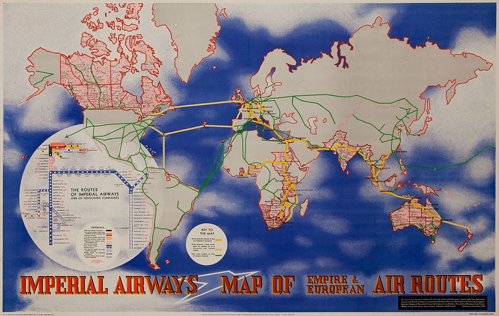
"During the pioneering years, aviation maps had essentially a prestige function. Just as the travel posters that were also in vogue during those years, the airline map provided a glimpse of the exotic, of the adventurous nature of flight," says Victoria Johnson, a cartographer who has studied extensively the history of airline maps. "Some airlines, such as KLM, Air France and Imperial Airways, went as far as commissioning their maps from artists that gave them a rather unique look and feel."
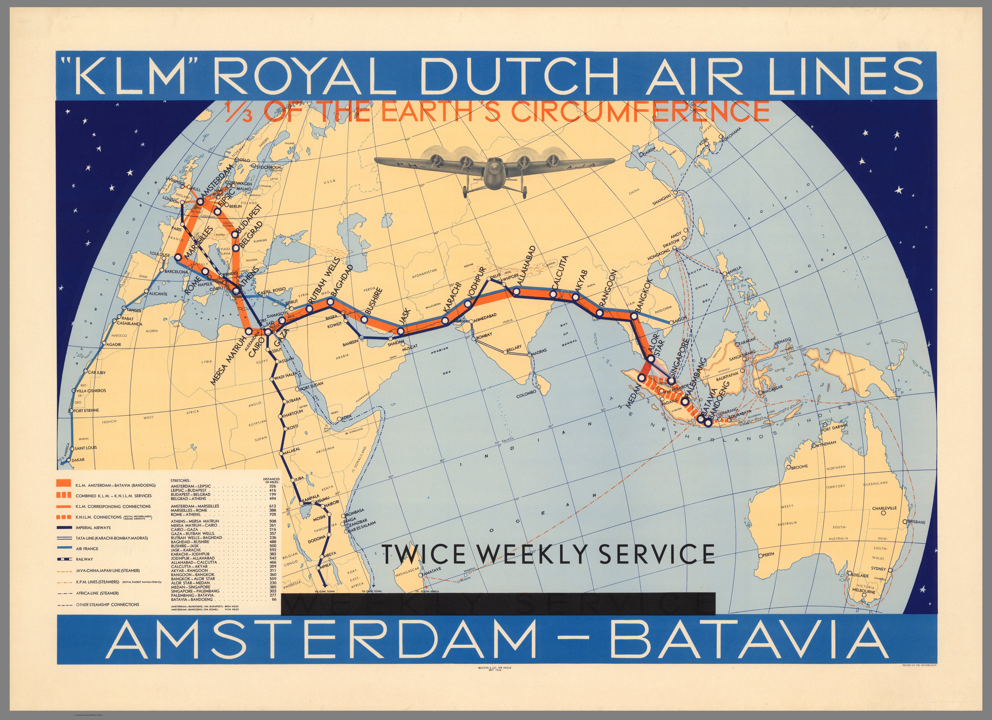
When airlines were the fastest link to the far reaches of Europe's colonial empires, getting there was no small feat. KLM's route to Indonesia above, for example, took weeks and 20-plus stops. The map is a throwback to an age long gone, with its depiction of the links to the Imperial Airways and Air France lines to the British and French colonies. Today, it's a nonstop jet flight from Amsterdam to Jakarta.
The postwar growth and consolidation of the airline industry and the sustained growth in passenger numbers led to airline maps becoming, inevitably, more utilitarian, but there was still some room for imagination.
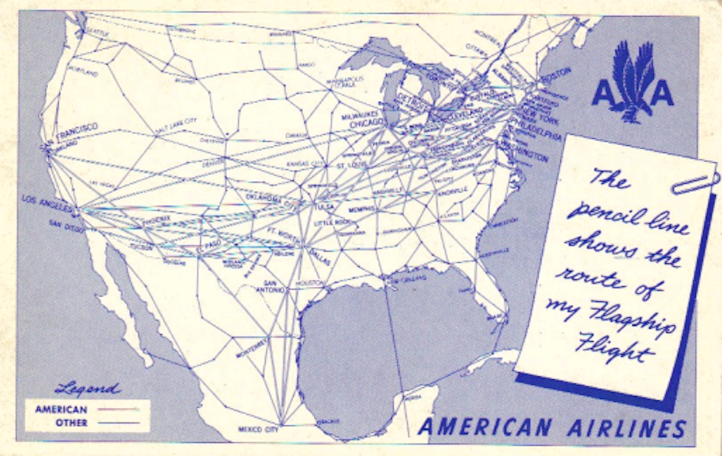
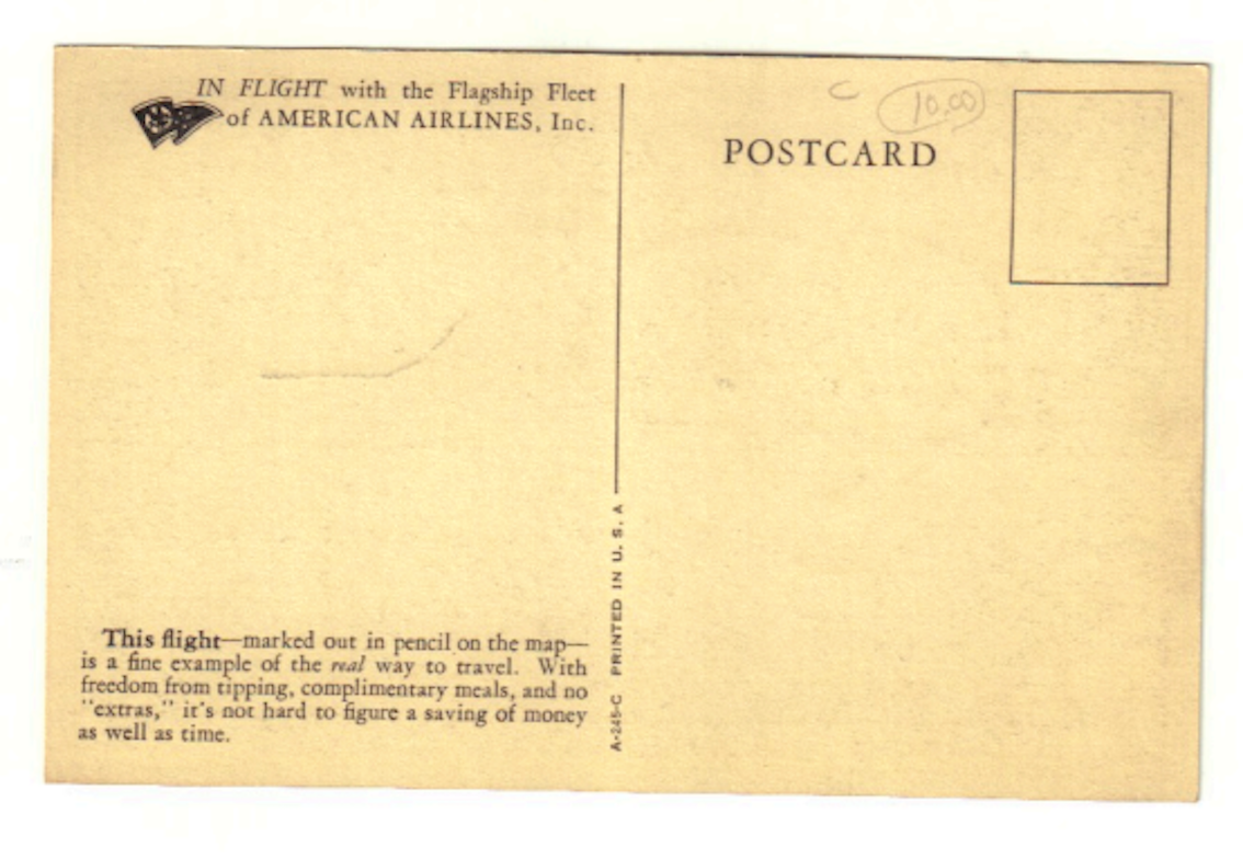
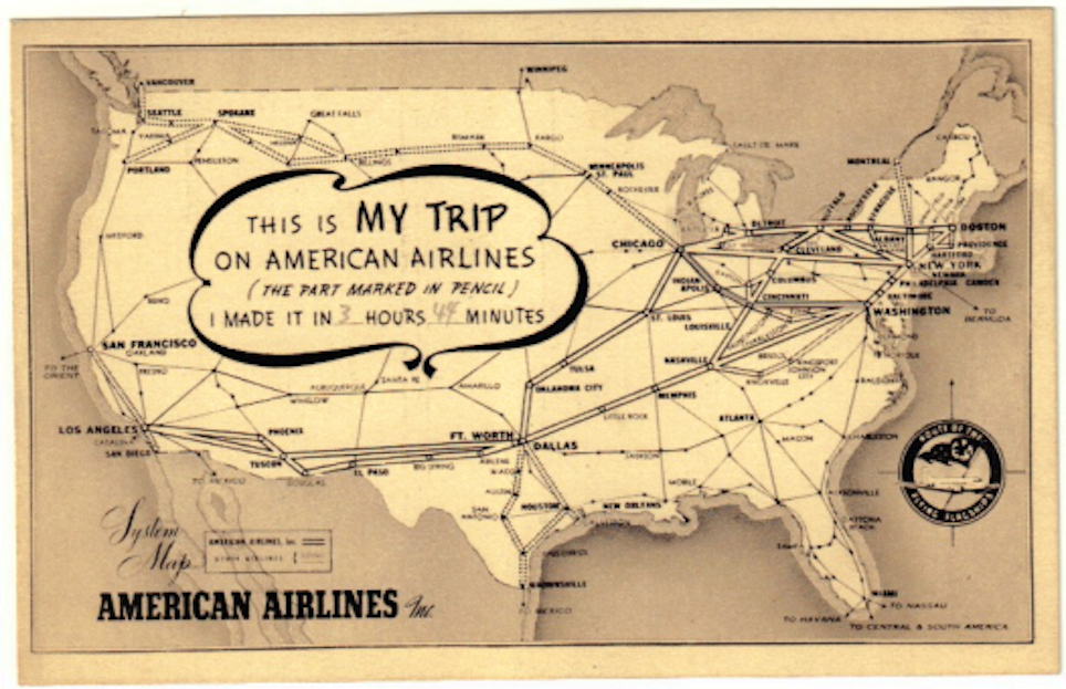
"Some airlines even gave postcards with a route map, where you could underline the itineraries you had flown and then send it to friends and family" Johnson says.
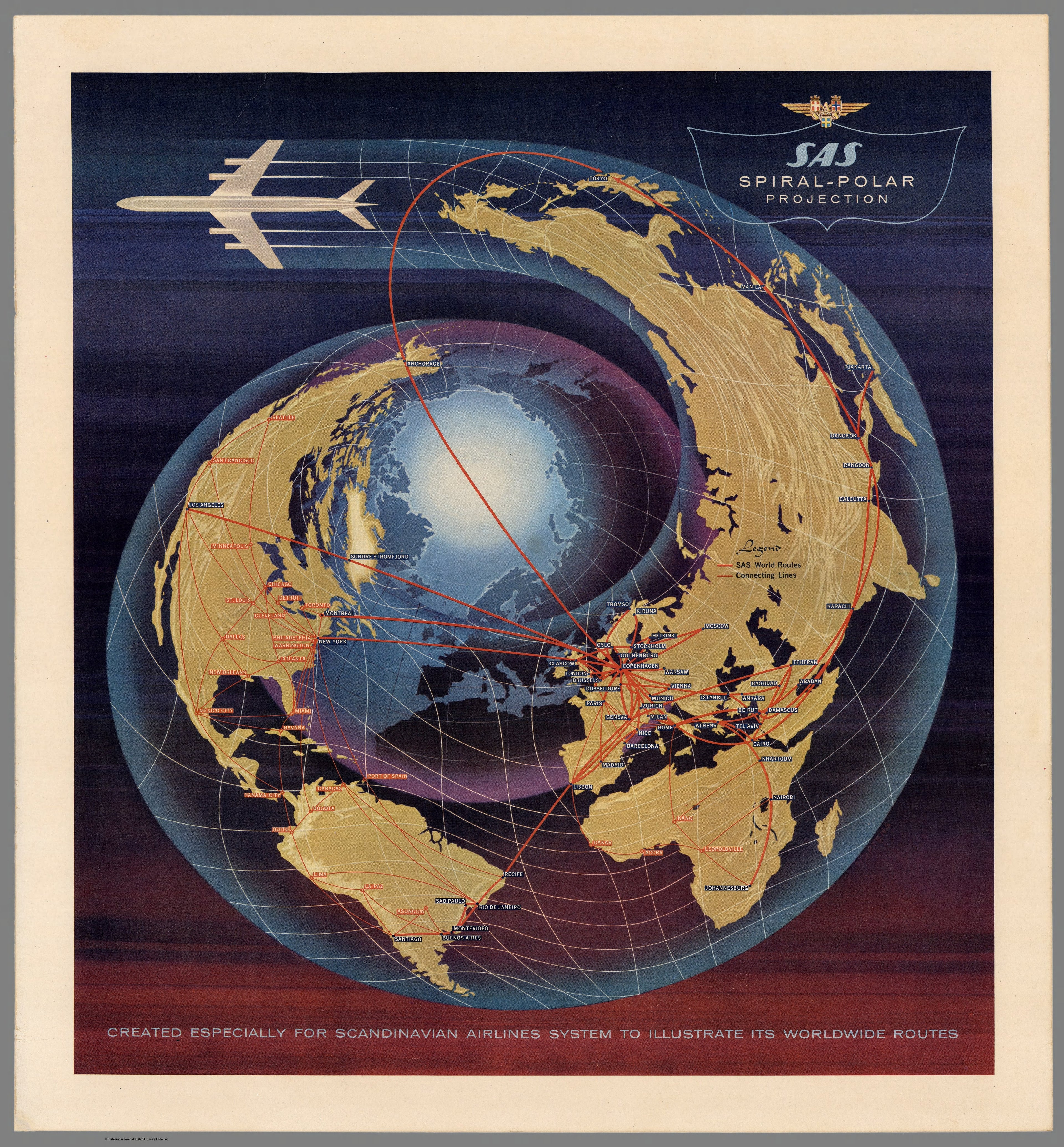
The advent of the jet age in the 1960 brought innovations for maps too. SAS Scandinavian emphasised its edge on early polar routes from Europe to Asia via Alaska with this "spiral-polar projection" map. Those early jetliners didn't have the range of today's: the maps shows that even getting from Copenhagen to Los Angeles, a distance of under 6,000 miles, required stopping for fuel in Greenland.
By the 1970s flying had already lost most of its adventurous allure. The airline map came to be seen as an addition to inflight magazines, often just a means to show the vast reach of an airline (and, in those days of state-owned carriers at least in Europe, of its home nation's clout in the world.)
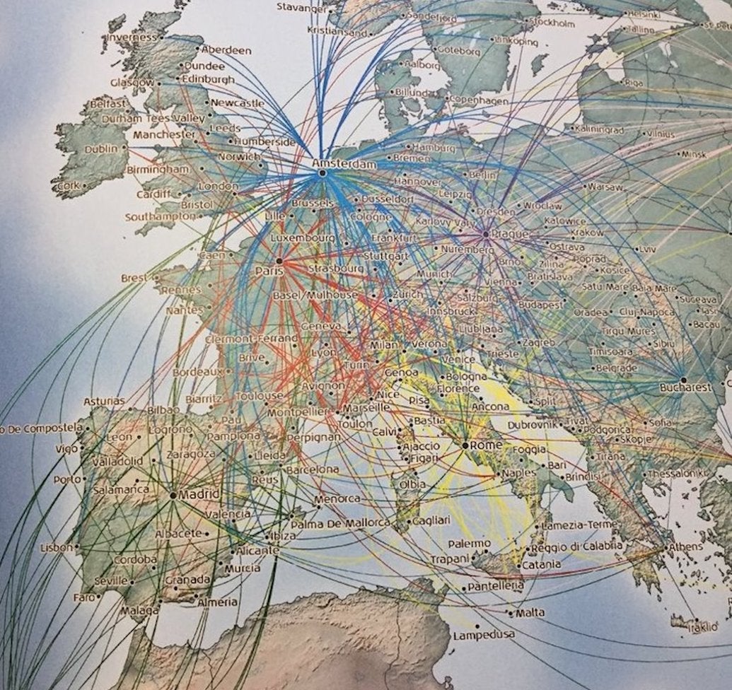
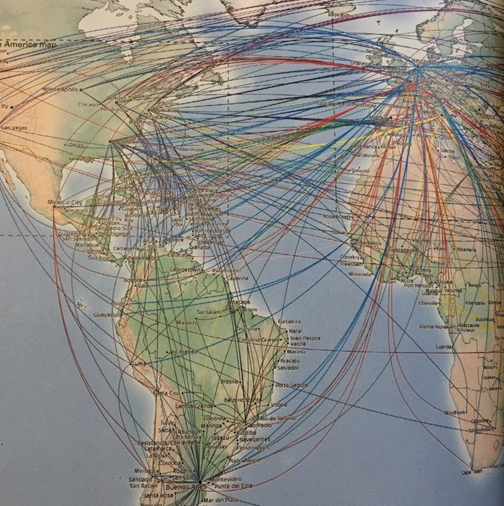
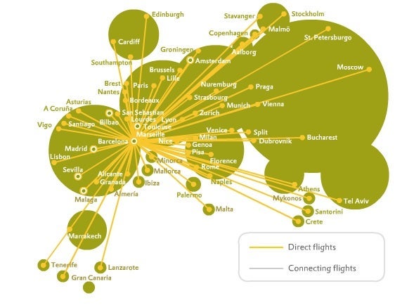
The development of the hub-and-spoke system also meant that route maps became incredibly dense. Try to make out every single connection in this one. (It's Air France-KLM, and the style has changed a bit since the 1930s — also because of airline alliances and transnational mergers.)

The "spaghetti-style" mess doesn't get any better when looking at long-haul maps. Air France-KLM's route network is just as dense when looking at the Atlantic. Those maps may not rank high in terms of beauty, but are also a corporate statement: the dense bundles of routes are a visualisation of the prominence and reach of the large network carriers. You may find it impossible follow the lines on the map, but you can just pull up the app on your phone to find a particular flight.
Daniel Huffman, a Wisconsin-based cartographer who recently worked on a new map design for a major Middle Eastern airline, is no fan of those spaghetti jumbles. "Those clusters of lines can look intimidating. Design has to be human," he says. "The key point of a map should be to inform people, it should be easy to follow. Those using it should feel there is a person behind it."
His map proposal for that airline client looks far more like something organic, with routes depicted as branches that spring out of a central hub.
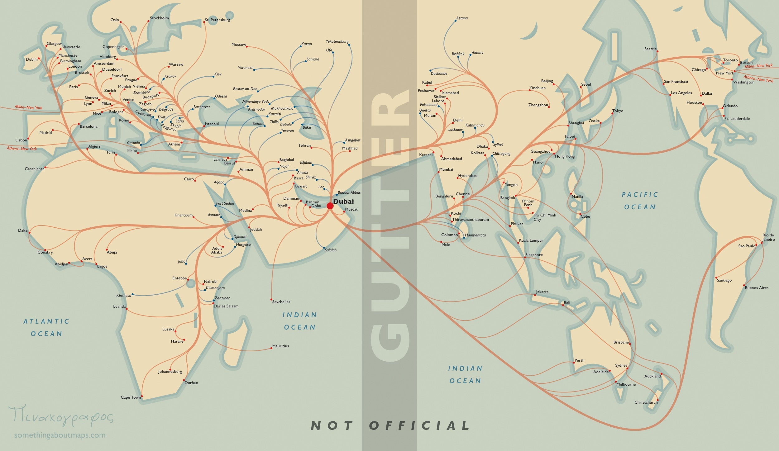
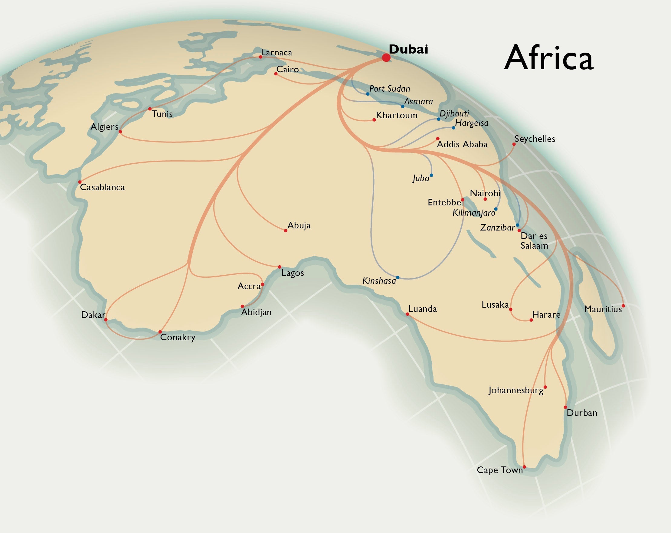
The airline client ended up turning down this particular proposal in favor of a more conventional design.
Besides the more traditional designs with their thin lines connecting the dots, a more abstract style has also emerged. Some airlines have opted for a minimalistic approach and done away completely with lines on the map. Vueling, the low-fare subsidiary of IAG, the parent company of British Airways and Iberia, follows this approach in its inflight magazine:
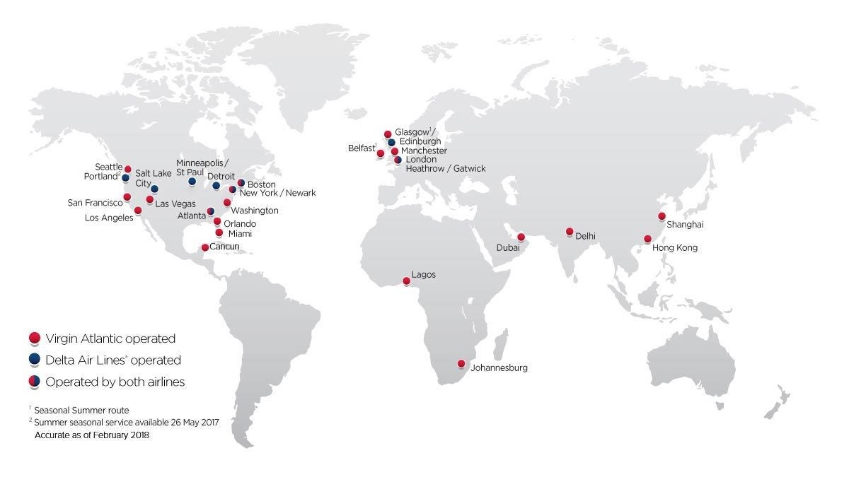
Virgin Atlantic uses different colors to convey information, for example to differentiate between destinations served by its own planes or through codeshare agreements.
Exact geographical features or even landmass contours may even be absent altogether from route maps. This is the case, for example, of the map Vueling uses on its website, as opposed to the inflight magazine:
Airline maps are going to keep evolving as airlines use digital tools more and more to communicate. Inflight magazines are an increasingly threatened species, and airline maps might move more and more to online only. But whatever the support they use, maps are likely to continue playing a role.
"Airlines will still be willing to impress and the map acts a bit as showcase of the whole firm," Huffman says. "After all, if the map is not good because the airline skimps on it, what deters the passenger from thinking, 'What else are they willing to skimp on?'"
TPG featured card

at American Express's secure site
Terms & restrictions apply. See rates & fees.
| 4X | Earn 4X Membership Rewards® points per dollar spent on purchases at restaurants worldwide, on up to $50,000 in purchases per calendar year, then 1X points for the rest of the year. |
| 4X | Earn 4X Membership Rewards® points per dollar spent at US supermarkets, on up to $25,000 in purchases per calendar year, then 1X points for the rest of the year. |
| 5X | New! Earn 5X Membership Rewards® points on prepaid hotel stays booked through AmexTravel.com or the Amex Travel App. |
| 3X | Earn 3X Membership Rewards® points on flights booked through AmexTravel.com, the Amex Travel App, or purchased directly from airlines. |
| 2X | Earn 2X Membership Rewards® points on prepaid car rentals booked through AmexTravel.com or the Amex Travel App and cruises booked and paid through AmexTravel.com. |
| 1X | Earn 1X Membership Rewards® point per dollar spent on all other eligible purchases. |
Pros
- Valuable dining and food-related credits
- Flexible rewards with airline and hotel transfer partners
- Multiple travel and purchase protections
- No foreign transaction fees
- Access to Amex Offers for additional savings (enrollment required)
Cons
- Not as useful for those living outside the U.S.
- Some may have trouble using Uber and other dining credits
- You may be eligible for as high as 100,000 Membership Rewards® Points after you spend $8,000 in eligible purchases on your new Card in your first 6 months of Card Membership. Welcome offers vary and you may not be eligible for an offer. Apply to know if you’re approved and find out your exact welcome offer amount – all with no credit score impact. If you’re approved and choose to accept the Card, your score may be impacted.
- Earn 4X Membership Rewards® points per dollar spent on purchases at restaurants worldwide, on up to $50,000 in purchases per calendar year, then 1X points for the rest of the year.
- Earn 4X Membership Rewards® points per dollar spent at US supermarkets, on up to $25,000 in purchases per calendar year, then 1X points for the rest of the year.
- New! Earn 5X Membership Rewards® points on prepaid hotel stays booked through AmexTravel.com or the Amex Travel App.
- Earn 3X Membership Rewards® points on flights booked through AmexTravel.com, the Amex Travel App, or purchased directly from airlines.
- Earn 2X Membership Rewards® points on prepaid car rentals booked through AmexTravel.com or the Amex Travel App and cruises booked and paid through AmexTravel.com.
- Earn 1X Membership Rewards® point per dollar spent on all other eligible purchases.
- Pay It® lets you tap in the American Express® App to quickly pay for small purchase amounts throughout the month and still earn rewards the way you usually do. Plan It® gives you the option to split up big purchases into equal monthly payments with a fixed fee. You’ll know upfront exactly how much you’ll pay.
- Updated! $120 Dining Credit: Earn up to a total of $10 in statement credits monthly when you pay with the Gold Card at Grubhub (including Seamless), Buffalo Wild Wings, Five Guys, The Cheesecake Factory, and Wonder. This can be an annual savings of up to $120. Enrollment required.
- $100 Resy Credit: Get up to $100 in statement credits each calendar year at over 10,000 qualifying U.S. Resy restaurants after you pay for eligible purchases with the American Express® Gold Card. That’s up to $50 in statement credits semi-annually. Enrollment required.
- $84 Dunkin' Credit: Earn up to $7 in monthly statement credits after you pay with the American Express® Gold Card at U.S. Dunkin’ locations. Enrollment required.
- $120 Uber Cash on Gold: Enjoy up to $120 in Uber Cash annually with your Gold Card. Just add your Card to your Uber account and you'll get $10 in Uber Cash each month to use on orders and rides in the U.S. when you select an Amex Card for your transaction.
- New! As an American Express® Gold Card Member, you can enjoy complimentary Hertz Five Star® Status. Enjoy benefits like skipping the counter at select locations, adding an additional driver at no additional cost*, and vehicle upgrades**. Benefit enrollment and Hertz Gold+ registration are required. *Additional drivers must meet standard rental qualifications and must be a spouse or domestic partner to qualify as complimentary. Other additional drivers subject to fees. **Benefits are subject to availability and vary by location. Additional Hertz program Terms and Conditions including age restrictions apply.
- Take advantage of a $100 credit towards eligible charges* at over 1,300 upscale hotels worldwide when you book The Hotel Collection through AmexTravel.com or the Amex Travel App **. *Eligible charges vary by property. **The Hotel Collection requires a two-night minimum stay.
- Book your travel through the Amex Travel App with added peace of mind – backed by American Express® service and support. Only for American Express® Card Members.
- Whenever you need us, we're here. Our Member Services team will ensure you are taken care of. From lost Card replacement to statement questions, we are available to help 24/7.
- No Foreign Transaction Fees.
- Annual Fee is $325.
- Terms Apply.